The Atlanta Hawks' New Court Is Just As Strange As Their New Jerseys [PHOTOS]
By Dan Jenkins
@DanTJenkins
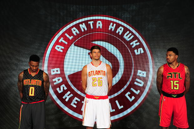
The Atlanta Hawks did one really, really great thing with their new rebranding -- they brought back the amazing "Pac Man" logo.
The logo has been updated from its classic look, but still retains its retro charm. However, that's where the brilliance of the new look stops.
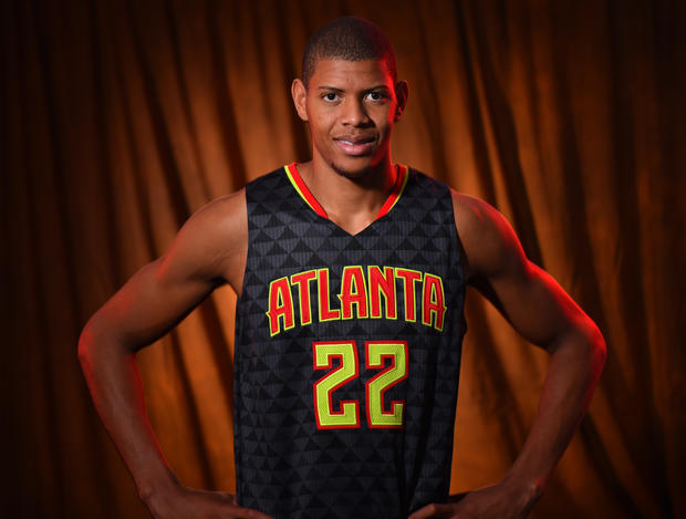
The Hawks design team proceeded to ruin the color scheme by adding a questionable neon green, which was apparently partially designed by the players, according to the Atlanta Journal Constitution.
"...the colors were decided upon fairly early in the process. Last September, he took the colors and uniform design to some players for their opinion. It opened another door of cooperation and players had a significant voice."
The look doesn't stop at the uniforms. The "Volt Green" and strange triangle pattern will spill onto the Hawks' home court.
It will be a sight to see when the Hawks mix-and-match their jerseys and shorts for home games.
This look is bold, I'll give it that. It is also polarizing -- fans either love it or hate it.
For all of the countless design changes the Hawks have had over the years, they really need to just pick something good -- like the Pac Man logo -- and stick with it.
