YouTuber's critique of Minnesota state flag finalists draws 1 million views
MINNEAPOLIS — Minnesotans seem equal parts transfixed and vexed by the vexillological quest to pick a new state flag design.
And folks also can't get enough of it in the world of YouTube.
A video posted late Wednesday — hours before the Minnesota State Emblems Redesign Commission made its choice for the final flag design — features the stick-figured, United Kingdom-based educational YouTuber CGP Grey giving his takes on the three design finalists. He has more than 6 million followers on the video-sharing platform.
RELATED: Minnesota's new state flag design is finalized
As of Tuesday, the day the commission finalized the flag design, the video has amassed nearly 1.3 million views.
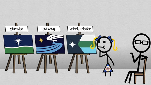
In his animated treatise on the finalists, CGP Grey has a clear favorite, which he calls "Polaris Tricolor." Here's how he describes the design:
Starting with a hoist design in the simplified shape of Minnesota herself. An eight-pointed star is centered inside with more of a twinkled look. And from that feature, tricolors extend for the lake's land and snow.
He goes on to say it stands out not only among state flags, but world flags. And it looks great both horizontally and vertically.
"Come on, girl. Contest over, right? It's awesome!" CGP Grey said. "It's a unique design element not just among state flags, but world flags. I kind of can't believe no tricolor hoist has inverted a triangle before because it looks so truly traditional."
It's unclear if commission members are big fans of CGP Grey, but "Polaris Tricolor," aka Submission F1953, was their ultimate selection for the new flag.
But the commission modified the original design, removing its stripes. That's a move CGP Grey was adamantly against.
RELATED: Why are there no loons on Minnesota's new state flag finalists?
"White stripe on top makes it more distinct from some of the most well-known tricolors. And the slightly muted colors convey a northern kind of cold coziness and look better together than brightening the blue," he said. "The design is so strong it would survive small changes, but they'd hurt my heart a bit."
He doesn't have much to say about the design called "Star Rise." Here's his description:
Star Rise centers the North Star here with eight points to distinguish it from the standard state stars. The blue is the sky that gives colors to Minnesota's 10,000 lakes, with a rolling green landscape for the forests and farms, and a bit of snow up top because, it's cold up top.
He calls this design "fine," and "mediocre good."
RELATED: Fly some of Minnesota's rejected state flag designs, with help from Indiana company
"My main complaint is that it's so good at evoking the idea of a landscape that it looks kind of odd when hung vertical," he said.
CGP Grey focuses most of his energy on annihilating his least favorite finalist, which he calls "Old Wavy." Here's his description:
Here again is a North Star, this time distinct as four points in yellow. And on the upper fly is described as wisps of snow, clouds, and aurora, that are reflected along the bottom half as the head of the Mississippi River. You might see a loon, the common loon is the state bird, you might not, but it's there.
CGP Grey calls this one "easily the awfulest," and so "painfully modern" that it's "destined to be dated in under a decade." And he calls its alternative design options "even uglier."
He says he even prefers Minnesota's old flag in comparison, which he believes is the worst state flag in the union.
"I think (Old Wavy) really represents the potential danger in flag redesigns. Maybe it can serve as a warning to any states who might want to go next," he said. "The goal of a flag is not to use pre-existing symbols but to become a symbol of its city, or state, or state state."
RELATED: Designer of new Minnesota state seal "honored" the commission chose his work
He says the state seal is where you should "stick all the stuff of the state on the flag, like the loon and the Mississippi and the, ah, aurora?"
By the way, he's a very big fan of Minnesota's recently adopted state seal, which he calls "a total banger!"
Alas, the non-Minnesotan American expat in the U.K. concedes his opinions ultimately don't matter.
"I'm just here because I can't stop myself from being on the edge of my seat to see what Minnesota selects for herself," he said. "Please pick Tricolor Polaris, though."
This video is actually his second about Minnesota's state flag search. The first was posted late last month, and is only available to view if you're a paying member of his channel.
NOTE: The original airdate of the video attached to this article is Dec. 15, 2023.


