What is the purpose of the "#ShowYourStripes" campaign?

ROCKFORD, Minn. -- It looks like colorful work of art, but it actually paints a concerning picture for our planet's future.
We wanted to know: What is the purpose of the #ShowYourStripes" campaign? Good Question.
Our Jeff Wagner learned how it's impacting the way our food grows.
'Tis the season to reward your sweet tooth at Knapton's Farm and Orchard, now in its fifth decade of business. Early summer is when visitors can pick cherries and raspberries.
More than 40 years ago, owner Melvin Knapton said that typically started around the Fourth of July.
"Even that was early some years [laughs]!" Knapton said.
The past 10 years, however, he says late June has been the norm, meaning the season is starting at least two weeks earlier than when his business began.
"You might notice on the southwest side [of the cherry trees], we paint white on the trunk," Knapton said.
The white paint reflects light and warmth, a tactic needed to keep the cherry trees from budding too early, then getting hit with a hard freeze. Knapton says they've been using the paint method for only seven to eight years, something he never needed to do in the beginning.
"Because we've had a few warm Februarys that have come in," he said, noting how the trees would be tricked into thinking it was spring.
"What's led to all the changes on his farm?
"Could be climate change, it is very possible," Knapton said.
His real-life experience matches up with a colorful chart getting shared across social media. Bernadette Woods Placky is chief meteorologist at Climate Central, the organization behind the #ShowYourStripes campaign.
"We're visual human beings. These pictures grab our attention," Woods Placky said.
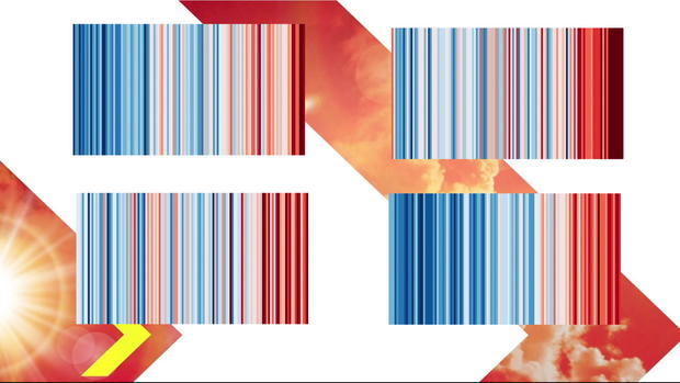
What does that color chart prove?
"What we see in the design is simple stripes going from blue to red. And each line is a global temperature departure from norm," she said.
Each vertical line represents a year dating back to 1850 and up to 2021. Blue shades mean the year experienced below-average temperatures. Red means above-average temperatures, a color dominating the chart since the 1990s. The difference anywhere from 1-2 degrees above the average. The number might seem small, but Woods Placky said the impact is large.
"Just that slightest shift in an average puts us into a whole new climate, really upping those chances for all of the extremes that we have to deal with," she said.
For Minnesota, that could mean heat that is more intense and lasts longer.
"Seems like springs are a little bit earlier and falls are a little bit later. At least in my observation the last 40 years or some we've been doing this," Knapton said.
Weather events, like tornados or polar vortexes, can increase in frequency.
What will happen if we persist this way?
"Unless we make big changes, this is only going to accelerate," Woods Placky said.
She says reducing the emissions humans produce is the top priority. That can be done by becoming less relation on fossil fuels.
#ShowYourStripes, no matter how the message is shared, ignites the conversation about climate change. Pictures from around the world show the stripes painted onto sides of buildings, on crosswalks in the road, or as a design on clothing. The campaign is brought up each year on the summer solstice.
"Our choices today really matter for what path we choose. We're not on a set outcome quite yet. If we can start bending our emissions curve today, that will lessen the future warming to a point where we can adapt to it," she said.
Click here to see the temperature changes for Minnesota, and click here to see the temperature changes for Wisconsin.


