So What's Up With Those Graphics?

The Politics Of Photoediting:
We use common sense and often work with news editors to tailor images to a given story. We don't go out of our way to achieve balance in the images we select, but it is something that we consider. (The site's editors are responsible for keeping an eye on issues of balance and looking at the editorial impact of the images used.) If there is a 500,000 person protest, and a 40 person counter-protest, we will make sure to throw in a photo from the smaller event, while giving major play to the larger. One of the great benefits of working on the Web is that space is unlimited. If there is conflict between which of two images is most appropriate, we just publish both.
Personal tendencies do come into play at times. During the first weeks of US operations in Iraq, I noticed that I had tended toward publishing fairly graphic images such as dead bodies and burned cars, where as other designers seemed to favor more editorial or artistically powerful images: Marines carrying babies, apache helicopters in the sunset. Obviously, we are often at the mercy of the image feeds we use, but there is inevitably a personal dimension to the process.
Photoillustrating:
We never doctor a news photo. However, when it comes to photo-illustrating - collages or 'generics' as we call them - we will often digitally manipulate images to emphasize a certain mood.


Obituaries:
This is very sensitive turf for journalists. It is common practice to prepare our obituary graphics in advance, especially if the subject has been ill for some time.

Usually, the graphic includes the year of birth and the year of passing. This can cause problems, as people have a tendency to outlive their obituary notices.

Recycling:
Due to fact that often have such brief turnaround on art requests, we spend much of our time repurposing elements from earlier graphics into new work. We have a huge file dedicated, for example, to Bush heads. These are cropped shots of the president, like some psychology study, capturing him in every conceivable mood.
For example, there's Stern Bush:

Bashful Bush:

And Happy Bush:

For most graphics, however, we re-use just one or two stock images over and over. As a result, there are a handful of elements that keep popping up on the site.

Lighter Fare:
To the great displeasure of our news staff, many of our most trafficked stories are the silliest.

Design Challenges:
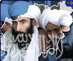
Certain requests pose more difficulty than others. Race is always tricky ... as is religion.

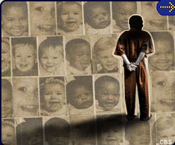
Another tough one: death. How, for example, does one create an image for a story on mortality rates, if no specific images are available? Child abuse and stories on teens are also problematic. Very rarely are photos released of underage suspects or victims. And wire services license very few generic photos of minors. What parent is going to sign over a photo of their kid, when it could end up illustrating a story on teen pregnancy or cyber-stalking? Our usual solution is to hide the child's face in the shadows, or crop them super-tight, or work with images of kids photographed from behind.
Another challenge is creating multiple graphics from a single available photo.
A few cases that come to mind: Chandra Levy, Osama Bin Laden, and Zacarias Moussaoui (for whom we are still using a badly outdated headshot.) The most memorable for me was the lead up to the execution of Timothy McVeigh. Three or four times a day, the home page editor would approach me and ask for a new McVeigh image. "We need something powerful." The problem was, only one usable photo existed of McVeigh. The results became more and more abstract.
Odds & Ends:
I remember preparing the infamous Abu Ghraib photos, in advance the "60 Minutes" broadcast. I found them very unsettling, but I admit I had no sense then that they would become as inflammatory as they did.

Finally, one of my favorite graphics, created more than three years ago, has sadly never seen the light of day:
