Is there a pattern in the tea party's primary woes?

The "establishment" is having a good year in the Republican primaries, but with more races to go, what can the 2014 vote patterns so far tell us?
Thus far the establishment candidates are winning handily most places, which makes it hard to differentiate between them and the tea party, and also because tea party voters are not relegated to any one kind of geography; not just to small-town or rural areas, say, nor even to one corner of the country. It's fair to say that wherever one finds Republicans, one finds tea party Republicans.
Nationally, our polls show tea- and non-tea party Republicans are similar in their wealth and education levels, with tea party backers about as likely to be college graduates and earn over $100,000 per year. That said, we have seen a little county by county variation across the two Senate primaries so far (North Carolina and Kentucky) that featured a single clear establishment favorite (Tillis, and McConnell, respectively) against one main challenger. That's also the case in Mississippi Tuesday night (for Thad Cochran).
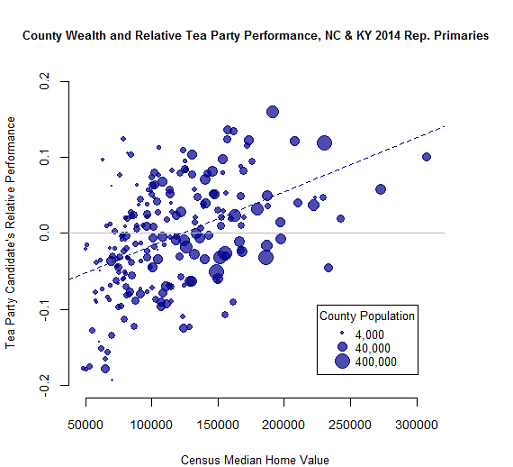
This chart shows the tea party candidate's relative performance across all the counties of North Carolina and Kentucky combined, and compares them by county wealth. There's a pattern and some correlation: the tea party candidate has done a little better in wealthier counties than they did elsewhere.
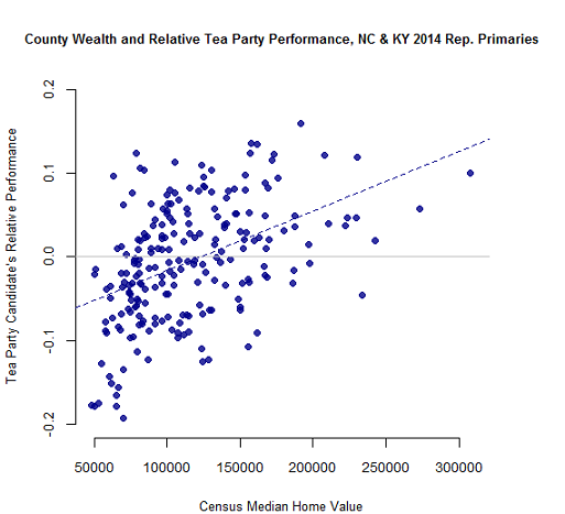
We measure the wealth of a county here by its median home value, as opposed to median income, which can help account for the fact that older voters and retirees can have wealth but not necessarily report "income" per se in polls once they've retired.
(Georgia's vote, it should be noted, mainly showed the strong regional bases for each of its candidates, so it's excluded from this analysis. That county map from Dave Leip's U.S. Election Atlas is here.) And some of this is due to Mitch McConnell's better performance in the coal country region of eastern Kentucky and find a description of McConnell's regional performances here.
Suburban and city counties are often wealthier, but this pattern doesn't appear to be just a function of population. If we include that in the plot - indicated by the larger dots as counties go up in size - we don't see any pattern of large versus small counties; it crosses all types.
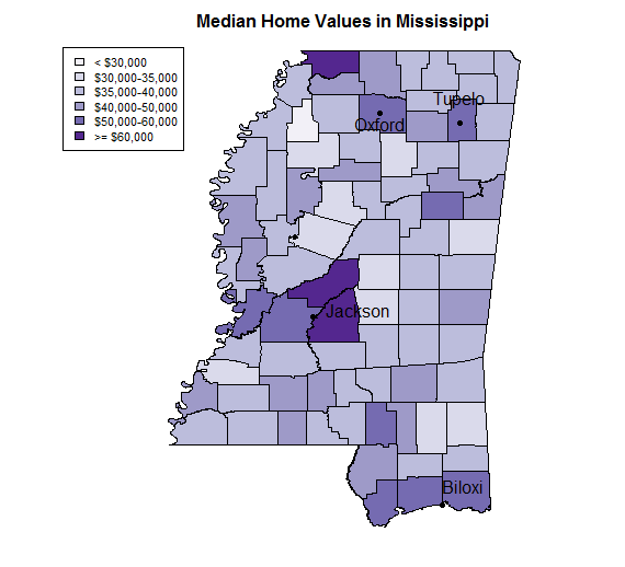
Now, looking to Tuesday's primary in Mississippi, here's a map of relative wealth in by county from U.S. census data. As you might expect we see higher values closer to cities, around Jackson and Oxford and on the coast in Biloxi.
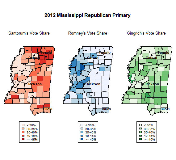
We've seen patterns correlated with wealth before. In the 2012 Republican presidential primary (a different race, of course, but the most recent we have) Mitt Romney's top five counties had median home value of $48,000 dollars, well ahead of the mid-30s for opponents Newt Gingrich and Rick Santorum.
There was also a positive correlation between home value and Romney's total vote share by county.
(And for a multi-year perspective on the state, Nate Cohn's description of some historical patterns in Mississippi is here.)
That hardly means these are the patterns that'll show up Tuesday night, but it's worth watching. In all, what we see so far in these primaries continues to back up what we see in the national polling data, that whether or not they win statewide, there is not yet one single region or typology that can be clearly be applied to Republican anti-establishment or tea party voters in 2014, but as the votes come in we'll see if these next set of primaries builds on these trends.