Giving credit: The creators of movie title sequences
For Hollywood movie makers, giving credit where credit is due is more than just a professional courtesy; it’s an industry all its own. Our Cover Story is reported by Lee Cowan:
At main title sequences go, “The Naked Gun” may not have been the most artistic in movie-making history, but it did its job remarkably well. It teed up the absurdity of the absurdly funny film that followed.
But like all title sequences, it fulfilled another need: distracting us from what we we’re really watching, a long list of names. That’s their role, to display each name for the contractually-agreed-upon time. (The industry standard, by the way, is about two seconds.)
But it also has to do it in a creative way, whether it’s with cafeteria food in “Napoleon Dynamite,” or the wind-blown fonts in “Twister.”
“You’re in the theater, the lights go down, and you see this amazing thing that will evoke an emotional response,” said Kyle Cooper, who has spent a lifetime evoking that response. He lit the fuse in “Mission: Impossible,” and took us under the microscope in “The Island of Dr. Moreau.”
He sees putting names on screen as the really utilitarian part of a title design. The art, he says, comes in how it all blends together with the music, to telegraph the look and a feel of a film without giving too much (or too little) away.
Cooper is perhaps best known for his title designs for “Se7en,” where he took the audience into the mad, but meticulous mind of a serial killer.
Cooper recalled, “I was at the premiere for ‘Se7en,’ and when we dropped that thing on the people, they went nuts, I mean, Woof!!!! There was a reaction.
“I consider these things to be short films,” he said.
“It’s a movie within a movie, is really what they are, the best ones anyway,” Cowan said.
“I think so.”
In the early days, main titles were just that -- titles with fancy fonts, like the fairytale look of “The Adventures of Robin Hood,” or the collosal look of “King Kong.”
“Beautiful, icon title card, strong music, you knew that you were going to see something larger than life,” said Lola Landekic, who is managing editor of a website called the Art of the Title -- an exhaustive resource for anyone to take a deep title sequence dive.
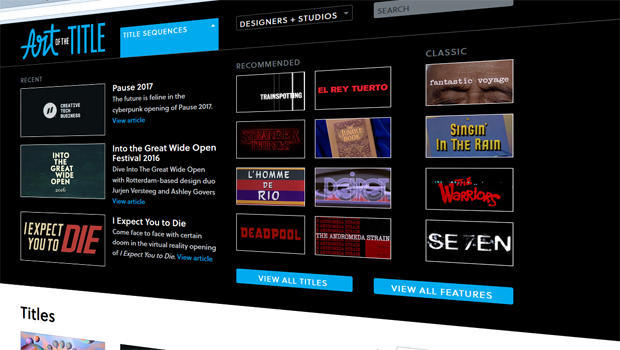
“Oh, it’s a rabbit hole” she laughed. “Yeah, I mean you can spend your life studying this.”
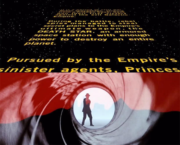
A good title sequence, she says, is all about mood. “Star Wars” gave us that once-upon-a-time feel, while Bond was pure intrigue. That iconic Bond gun barrel was the design of Maurice Binder back in 1962, and it has stood the test of time.
For “From Russia With Love” and “Goldfinger,” designer Robert Brownjohn took to projecting titles onto models -- and that too, stuck.
“You have the gadgets, the guns, and the girls. That’s the trifecta!” laughed Landekic.
But if there’s a patron saint of title design, most agree it would be Saul Bass. You know his work if you’re a fan of Otto Preminger (“The Man With the Golden Arm”) or Alfred Hitchcock (“Vertigo,” “North by Northwest,” “Psycho”).
“They were very abstract,” said Landekic. “But it depends on how you’re looking at it. I would look at something like ‘Psycho,’ and you could argue that it’s abstract, or you could argue that it’s literal, because ‘Psycho’ is sliced up.”
As for “Vertigo,” from the first few seconds of the film, “you feel dizzy, and you don’t know what’s happening.”
Which, of course, was precisely the point. “These things are working on you in this way that is totally subconscious,” she said.
Godo ones work even when you don’t know they’re working.
And it’s not just theatrical releases; “The Sopranos” started an arms race in TV main title design. Gone are the “meet the cast” days of “The Brady Bunch”; now we have the more nuanced look of “Mad Men,” or the beautifully eerie look of “Westworld.”
Patrick Clair has won two Emmys for Best Main Title Design in TV -- first for “True Detective,” and again last year for “The Man in the High Castle,” a series that ponders the question, what if the Allies lost World War II?
Its signature moment may be the shadow of paratroopers -- made to look like tears on the face of Mount Rushmore.
Cowan asked, “What ingredient, if there is one, makes a really good title sequence?”
“It’s gotta be simple,” Clair replied. “I look at my favorite title sequences and they all have a very sort of pure, simple idea at the heart of them. Whether it’s the brutality of cooking breakfast in a show like ‘Dexter,’ a dead body being prepared for burial in ‘Six Feet Under,’ you take these simple acts and you turn them into something that really speaks to the journey of the characters.”
Finding that simplicity, however, can be a super-human challenge, especially in the sometimes complex universe of super-heroes.
Erin Sarofsky has designed title sequences for four Marvel films, including “Captain America: The Winter Soldier,” and the beautifully intricate “Dr. Strange.” But in both cases her designs came at the end of the film, not the beginning.
“The movie doesn’t end on the final frame,” Sarofsky said. “It ends really after the director is kind of finished having his way with you, so to speak. So it’s like the sorbet at the end of the meal. Can’t skip the sorbet!”
“Main on ends,” as they’re called, may have the toughest job of all: keeping you in your seat.
Cowan asked, “What do you want them to take away from your title sequences?”
“Well, I want them to wait to the very end of the scroll and look for our name,” she laughed.
As an added incentive to stick around, Marvel has taken a page from “Ferris Bueller’s Day Off, which featured an end title surprise. (“It’s over. Go home!”)
If you stick around long enough through the end of Marvel’s “Deadpool,” you get a great spoof, a reminder that it’s worth those few extra minutes of your attention -- whether at the beginning, or the end -- to give credit to those giving credit, too.
For more info:
- artofthetitle.com
- Prologue (Kyle Cooper)
- Elastic.tv (Patrick Clair)
- erinsarofsky.com
See also:


