After 64 years, the "Eye" still resonates
In an age where companies pursue relentless innovation in order to stay relevant to consumers, it's easy to lose sight of another quality with a proven track record: timeless simplicity.
Look no further than tech giant Google's recent brand update for an example of the enduring power of the simple. Last month, after 16 years, Google shed the extra curvature of its typeface in favor of a more straightforward, boxier design in the Modernist tradition.
In the same way, a growing number of brands are looking to reinvigorate their image by harkening back to a reductionist style. Home-sharing startup Airbnb, payment app Square, even Domino's Pizza have logos with roots in the Modernist tradition.
One logo that has typified the endurance of that tradition is the CBS Eye, currently the focus of an exhibit touring the country, "Revolution of the Eye."
The "Eye" was conceived at a time when television was rapidly gaining credibility as a new communication medium, increasingly pushing its predecessor, radio, to the periphery. By 1951, CBS Television was on top of the charts with the debut of "I Love Lucy" and its first news documentary series, "See It Now," hosted by storied newsman Edward R. Murrow.
CBS' then-president, Dr. Frank Stanton, recognized the need to create an identity for CBS Television that would differentiate it from CBS' radio network. He called on William Golden, creative director of CBS' advertising and sales promotion department to design the on-air symbol that would function as the face of the network and encapsulate its spirit.
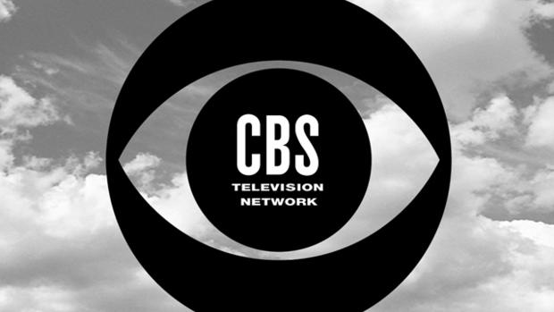
The result was the Eye, which was first introduced to the public 64 years ago this week.

Golden attributed his inspiration to the hex symbols resembling the human eye on Shaker barns, featured in a 1950 article in the publication Portfolio 1. With the help of graphic artist Kurt Weihs, the Eye was drawn. In an essay that first appeared in Print Magazine in June 1959, Golden describes the initial process, and the lukewarm reception the Eye initially received: "To tell the truth, I had submitted three identifications to a dozen or so people who attended the original viewing. I can't report that any of them - including the "eye" - were received with uncontrollable enthusiasm."
Originally conceived as the network's logo for just one season, Stanton actually opted to to keep it, reminding Golden of an advertising axiom: "Just when you're beginning to get bored with what you have done is probably the time it is beginning to be noticed by your audience."
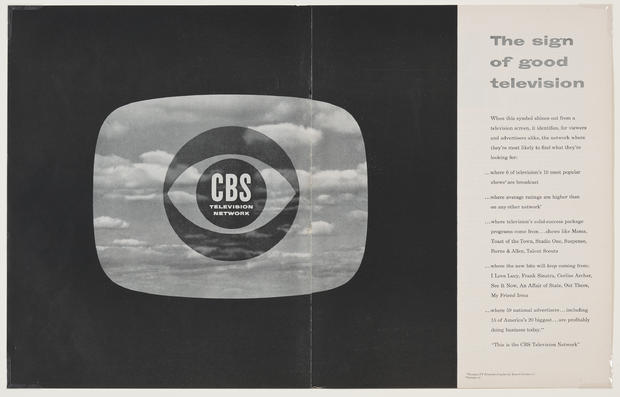
Beyond print advertisements, the symbol was used throughout the network -- on cameras, buildings, cards and other executive memorabilia. It was also used on the facades of both CBS Television City in Los Angeles as well as CBS' corporate headquarters in New York.
At first, the symbol was intended to be in motion. The Eye's center was a camera iris that opened and closed to reveal the network's identification. Another print version featured clouds in the background, reminiscent of René Magritte's painting, "The False Mirror."
The simplification of the logo took place fairly early on, as the design team recognized the power of a minimalist icon. Maurice Berger, curator of "Revolution of the Eye" exhibit, points out that the logo's success came not only because "the average person could read it," but "it was at once complex and conceptual."
As a purely visual identification, the Eye became symbolic of the fundamental quality that set television apart from radio. Berger explains, "for Golden, design had to communicate and make desirable whatever it was he was trying to sell." CBS' logo stood apart from other designs at the time, including other networks' logos, because it did not depend on readability or movement.
By keeping the outline simple, Golden gave the Eye a kind of staying power that would have been harder to achieve had it been more detailed or figural.
More than 60 years later, the Eye continues to resonate and remain, in large part, unchanged. Jens Müller, designer and author of Logo Modernism credits the Eye's staying power to its design.
"The design is so simple you can't tell what time period it was done."
The "Revolution of the Eye" opens at the NSU Museum of Art in Fort Lauderdale, Florida, on Oct. 24.