Did you fall for this financial April fool's joke?
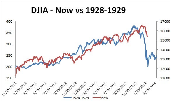
I've always enjoyed a good April Fool's joke, as long as it's harmless rather than costly. And speaking of costly, a couple of months ago you couldn't avoid seeing articles claiming the current stock market bore an uncanny resemblance to 1929. Supporting that claim were anxiety-inducing charts, like the one here, that had many people asking me if they should sell. After all, the so-called plunge through Feb. 3 was only the beginning.
I filed these articles away, because they predicted that by today, April 1, the full 1929-style crash would be here. Instead, markets stabilized and recovered. Unfortunately, those who sold got an expensive April fool's joke. But no matter if you fell for it or not, you can still learn some valuable lessons.
First, finding high correlations is easy enough to do -- and ultimately meaningless. Though the chart's comparison of today's market to 1928 and 1929 may appear uncanny, if you regress any set of data to a thousand random sets of data, you're likely to soon find one offering a 99.9 percent confidence that the sets are related. This sort of data mining can yield some pretty absurd conclusions. For instance, the highest correlation ever found to the U.S. stock market was the amount of butter produced in Bangladesh.
Second, correlation is not causation. One article I read said current market behavior can be nearly 90 percent explained by what happened in 1929. The fact that data sets have a high correlation does absolutely nothing to show whether there's causation.
Third, people can mislead with data and charts. While I created the chart above, it was similar to many seen a couple of months ago. Note that the percentage increase on the left axis (1928-1929), going from 150 to 400, shows an increase of 167 percent, while the increase on the right axis (current market) went from 11,000 to 17,000, or only a 55 percent increase. The percentage magnitude of what recently occurred was exaggerated by a factor of more than three to make the relationship look uncanny.
Thus, the three components of this costly joke were data mining for high correlation, confusing correlation with causation and distorting scale to exaggerate the relationship. Tons of supposed relationships like this get thrown around.
Mathematically speaking, the more you move into and out of the market, the lower your expected performance. That's because such moves increase volatility versus the consistent allocation, and higher volatility translates to lower total return. No matter how compelling an argument is for stock performance over the next few months, don't fall for it.